Customize your Space
When you are inside your own Space, the owner badge will display an icon. Click this Edit Icon or double-click the Space name to open the Edit Space UI.
General Tab
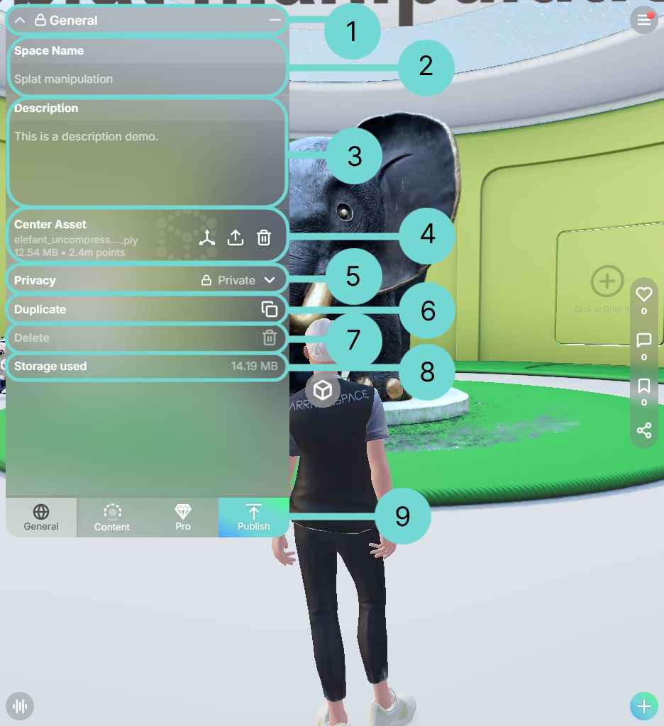
This tab allows you to modify the fundamental settings of your Space. You can also view the current storage usage for this Space here.

1Top Bar
The top bar allows you to close the Space Edit UI via the icon, minimize it using the icon, and view the current privacy setting of the space. If the space is public, no icon is displayed.
The available privacy icons are:
2Change your Space name
Click within the input field to change the title of your Space. Renaming your Space will not alter its URL.
3Description
Click inside the text area to edit the description of your Space. You can freely use the Enter (Return) key to create line breaks within the description.

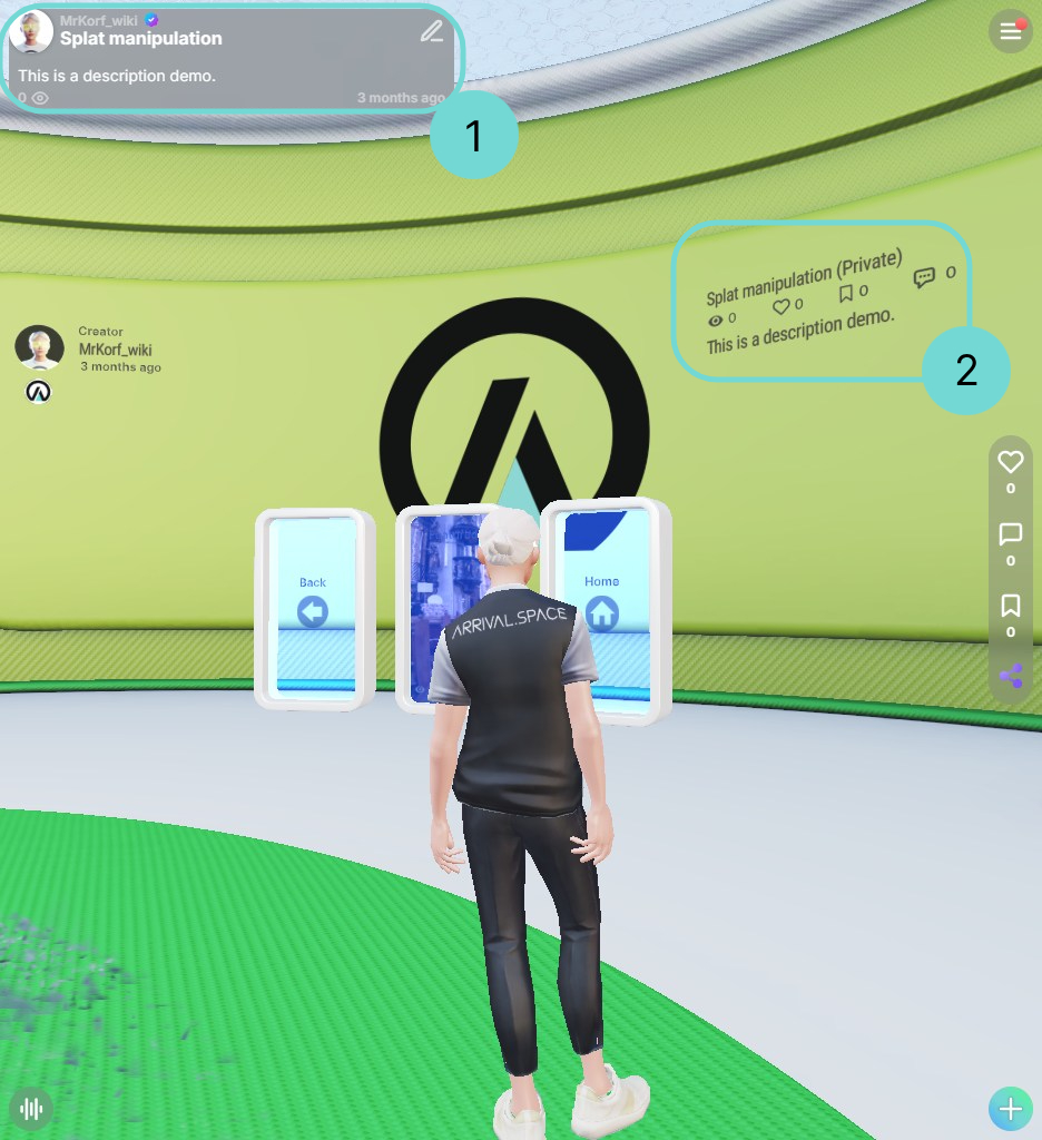
This description will be visible in your owner badge when you click on the Space name 1 and on the backwall within the Space 2.
You can use HTML to format the description text. However, please be aware that you are responsible for the correct HTML formatting. Color customizations, which are explained later, will not be applied to HTML elements. Line breaks must be inserted using the <br/> tag.
4Main Asset
The Main Asset is a key element within your Arrival.Space. Many creators utilize it as a primary representation of a real-world object or scene. If you click it, the UI will change to the Content Tab Detail View. More details can be found in section 3D Content.
For displaying websites, it is a better idea to use Gates because they offer more control and display options. See the Gates section for more information.
Detailed description can be found in section Gizmo
DeleteUse this button to easily remove the current Main Asset.
UploadTo upload a file as your Main Asset, click the upload icon to open your device's file manager. You can also drag and drop files directly into the Main Asset area.
More information can be found in section Upload Main Asset.
5Privacy
Your chosen privacy setting determines the discoverability and shareability of your Space.
- Link only: The Space can only be accessed via the direct, exact link. You can bookmark it if you have visited it before, but it will not appear in search results or Space lists. Anyone with the link can enter. Commercial Creators can add passwords to these types of spaces to limit access.
- Private: The Space is completely hidden and cannot be found or accessed by anyone else.
- Public: The Space is discoverable through the search bar and in other creators' Space lists. Anyone can enter the Space.
6Duplicate
By using this option it will duplicate your current Space.
7Delete
By using this option it will delete your current Space.
8Storage
This is an overview of the currently use storage by this Space. This information does not update immediately; refresh the page to see the most accurate usage. For details on your total available storage, please refer to the Storage section.
9Publish
This button appears in private spaces after you've made a change. Clicking it sets the space to public and opens the Share interface, allowing you to share your newly created space on social media platforms or embed it on your website.
Content Tab
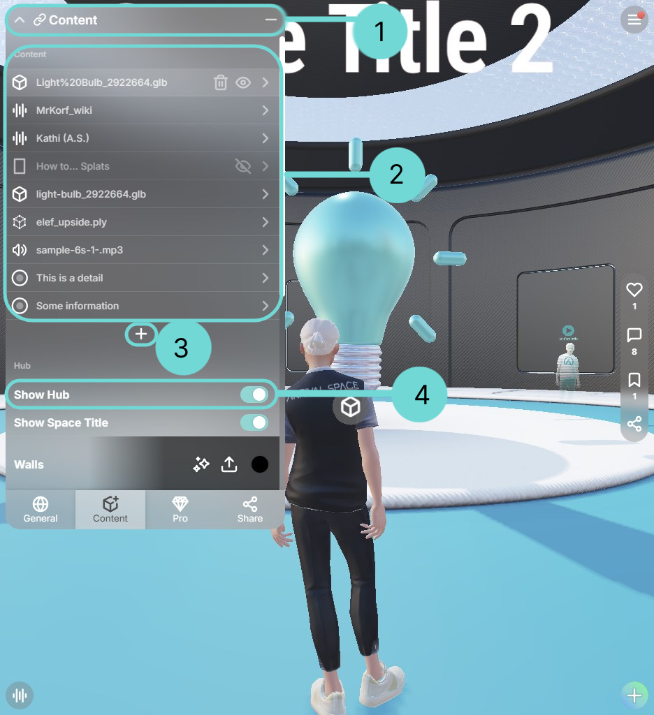
The content list provides an overview of all entities within a space. By default, the list is sorted by upload date.

1Top Bar
The top bar is a key navigation element within the content list. When an asset is selected, the title changes from Content to the name of the selected entity. At the same time, the Close button is replaced with a Back button, allowing users to return to the content list.
CloseCloses the Space Edit UI and automatically saves all changes.
Go backReturns you to the content list when viewing content details.
Minimize listMinimizes the content list – helpful on smaller screens or when you want to focus on the main view.
Once the Space Edit is open, you can select assets using the mouse. To do this, either click on the floating gray buttons or, in some cases, directly on the entity itself. If the frame of an entity is clickable, it will be highlighted with a blue outline
2 Content List
The Content list as an overview of all your Assets inside a Space. By selecting one asset your view will change into the content detail view.
By hovering over the entries, the quick asset switcher will be displayed.
Delete AssetDelete the current highlighted Asset.
Hide AssetHide the current highlighted Asset.
Show AssetDisplay the hidden asset again.
The Main Asset is always displayed at the top of the list. The icon will change depending on the type of content. You can find an overview of all icons under overview supported format. All further Settings for Meshes and Splats can be found in section 3D Content.
Please follow the links in the symbol overview to find the correct section and more information about the detail view:
3Open Action Menu
Use the icon to open the action submenu.
4Hub Option
To adjust the HUB settings, go to the Content Tab and select HUB at the top. If the HUB is deactivated, some settings will be grayed out. Once the HUB is enabled, these settings become adjustable.

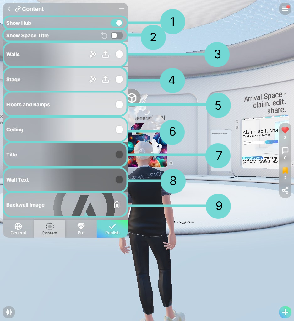
1Disable default Architecture
Use this toggle to enable or disable the default architectural structure within your Space. Disabling it is useful when you want to showcase large, walkable splats without any other visual elements.
2Show Space Title
With Create Space you have the option to disable the architecture. This automatically hides the Space Title. If this is not desired, you have the option of displaying the Space Title here. To do this, use the icon or use the toggle.
349Textureable Elements
The walls, stage, and backwall can be textured. This allows you to upload an image or generate one using DALL-E to use as an overlay for these elements. For a detailed explanation go to section Generating Textures.
5678Further Customizations
The floors and ramps, ceiling, title text, and wall text can be customized by selecting colors. The color picker interface vary depending on your browser and operating system.
Share Tab
Clicking the Share tab will prompt you to confirm the privacy setting if the Space is not already set to link only or public. After confirming the privacy, the Share UI will open, allowing you to choose how you want to share your Space.
More detailed information will follow in Section Share UI.